
Branding
Branding
Syeda Beauty
Syeda Beauty
Client: Syeda Beauty, founded by Seyda Zahan, is an e-commerce beauty brand offering affordable, cruelty-free, vegan false eyelashes for all eye shapes and sizes. The brand primarily targets women aged 16–35, including beauty enthusiasts, makeup artists, and young professionals.
Client: Syeda Beauty, founded by Seyda Zahan, is an e-commerce beauty brand offering affordable, cruelty-free, vegan false eyelashes for all eye shapes and sizes. The brand primarily targets women aged 16–35, including beauty enthusiasts, makeup artists, and young professionals.
Client: Syeda Beauty, founded by Seyda Zahan, is an e-commerce beauty brand offering affordable, cruelty-free, vegan false eyelashes for all eye shapes and sizes. The brand primarily targets women aged 16–35, including beauty enthusiasts, makeup artists, and young professionals.
My Role: Assist with the rebrand by refining the visual identity, redesigning packaging and print materials, and supporting the website transition to Shopify.
My Role: Assist with the rebrand by refining the visual identity, redesigning packaging and print materials, and supporting the website transition to Shopify.


Final Deliverables
Final Deliverables
Final Deliverables
Logo - Completed
Icons - Completed
Brand guideline - Completed
Business Cards - Completed
Thank You cards- Completed
Website Design - In Progress
Packaging - In Progress
Logo - Completed
Icons - Completed
Brand guideline - Completed
Business Cards - Completed
Thank You cards- Completed
Website Design - In Progress
Packaging - In Progress
Logo - Completed
Icons - Completed
Brand guideline - Completed
Business Cards - Completed
Thank You cards- Completed
Website Design - In Progress
Packaging - In Progress
Phase 1 - Pre-production Planning
Phase 1 - Pre-production Planning
Phase 1 - Pre-production
Planning

Thank You Card Updates
To complement the revised business cards and website, I adjusted the thank you cards to align with the brand’s new refined look. This included:
- Simplifying the layout
- Swapping the icon to the new logo
- Updating the color of icons to match the final palette
- Enlarging the logo and improving placement
- Adding space for handwritten messages
- Emphasizing the discount code with bolder styling
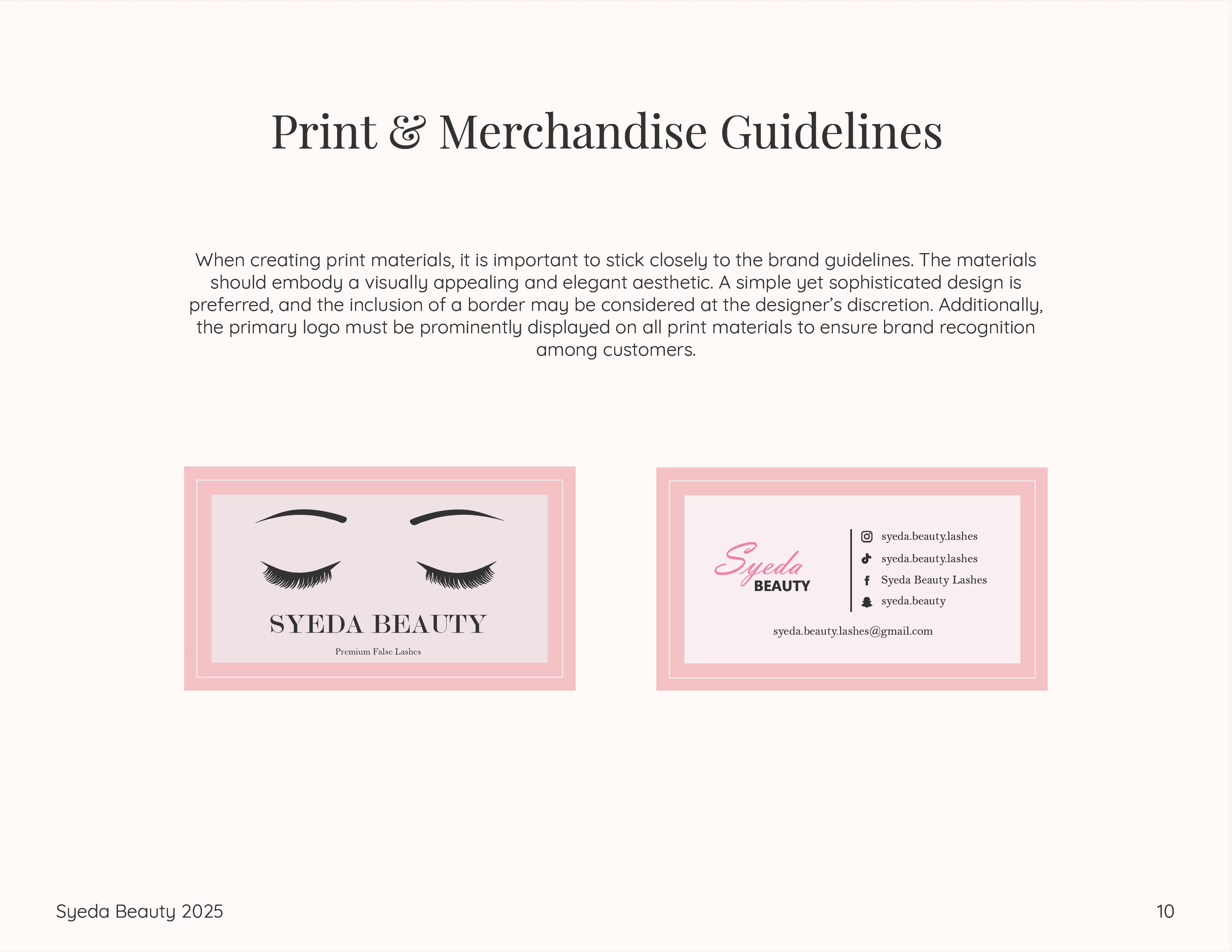
Business Card Redesign
For the new business card design, I:
- Removed the circular border in favor of sharper edges to resemble high-end eyelash packaging.
- Added “Premium False Lashes” to highlight the product offering.
- Updated the logo font to a more modern, luxurious typeface to Modern No. 2
- On the back, replaced the heart icon with the new logo and switched the body font from Poppins to Playfair Display for a more elegant look.


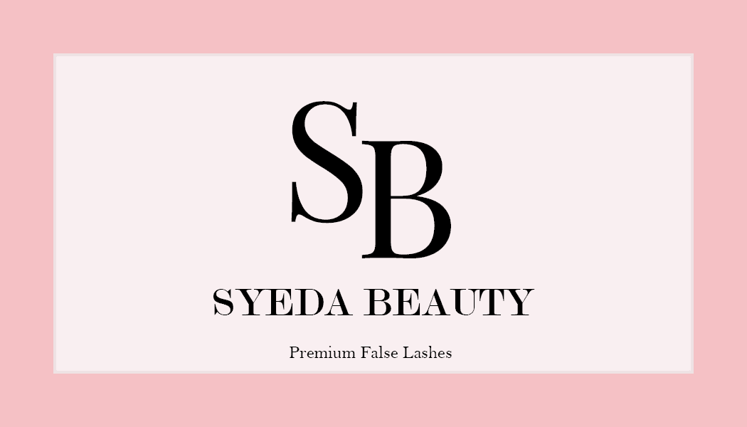
Final Logo
Rough Draft
#ddbe80
#ddbe80
#eee2e4
#eee2e4
#f7b0bd
#f7b0bd
#d46284
#d46284
#333333
#333333


Hi-Fidelity Website Prototype
Although limited on time, I designed several high-fidelity screens to reflect the new visual identity. The prototype included the refined color palette, updated fonts, and branding direction. The client responded positively and had no further changes at the time of review.
Refining the Brand Color & Typography
After designing the initial web and print materials, I realized that the original pink chosen for the logo didn’t maintain consistency across the brand. I adjusted it to a lighter, secondary pink from the color palette for better harmony and readability across print and digital formats.
Business Model: Direct-to-consumer online retailer. Products are sourced from manufacturers and sold exclusively through the brand’s website.
Business Model: Direct-to-consumer online retailer. Products are sourced from manufacturers and sold exclusively through the brand’s website.
Project Goals:
Rebrand with a more memorable, luxurious identity.
Expand the product line and shift the e-commerce platform from Wix to Shopify.
Boost brand visibility and grow social media following.
Redesign key brand assets to reflect a feminine, elegant, and bold aesthetic.
Project Goals:
Rebrand with a more memorable, luxurious identity.
Expand the product line and shift the e-commerce platform from Wix to Shopify.
Boost brand visibility and grow social media following.
Redesign key brand assets to reflect a feminine, elegant, and bold aesthetic.
Phase 2 - Production
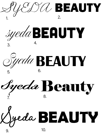
Typography Exploration & Logo Design
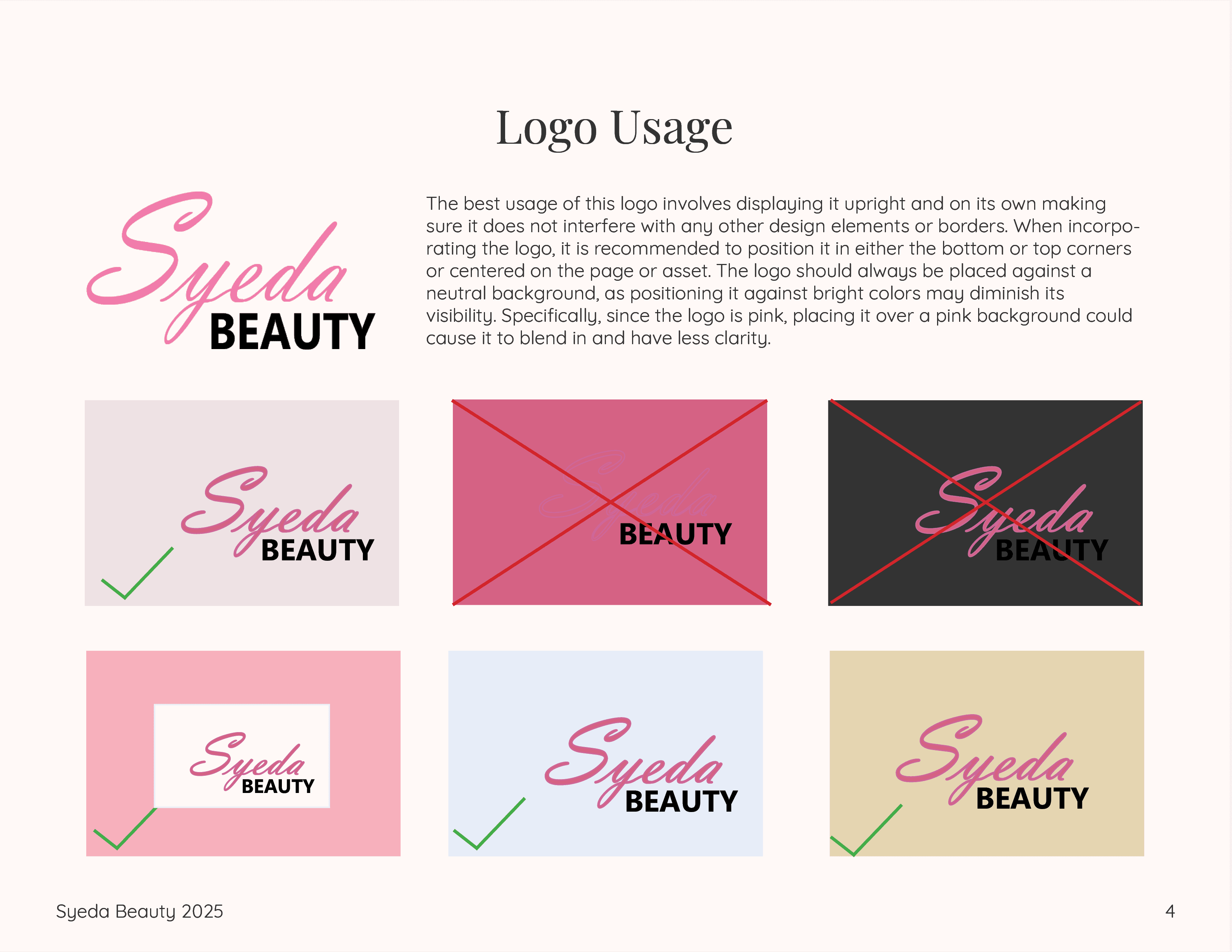
During the branding process, the client was very particular about the typography. From our initial meetings, she emphasized wanting "Syeda Beauty" to use two distinct fonts — “Syeda” in a script style, and “Beauty” in either a serif or modern sans-serif. After extensive trial and error and collaborative feedback, we landed on a combination that she felt aligned with her brand. I contributed to the final design by choosing the layout and color pairing, blending both typefaces in a way that felt cohesive and refined.
Typography Exploration & Logo Design
During the branding process, the client was very particular about the typography. From our initial meetings, she emphasized wanting "Syeda Beauty" to use two distinct fonts — “Syeda” in a script style, and “Beauty” in either a serif or modern sans-serif. After extensive trial and error and collaborative feedback, we landed on a combination that she felt aligned with her brand. I contributed to the final design by choosing the layout and color pairing, blending both typefaces in a way that felt cohesive and refined.
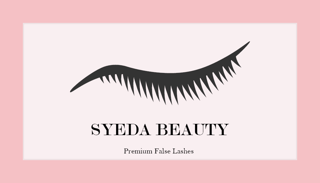
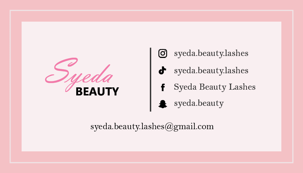
Business Card Design
For the front of the business card, I was inspired by eyelash packaging — placing a large lash icon prominently in the center, with the brand name just below it. The back of the card included key contact information and the logo.
Business Card Design
For the front of the business card, I was inspired by eyelash packaging — placing a large lash icon prominently in the center, with the brand name just below it. The back of the card included key contact information and the logo.
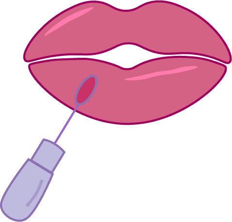
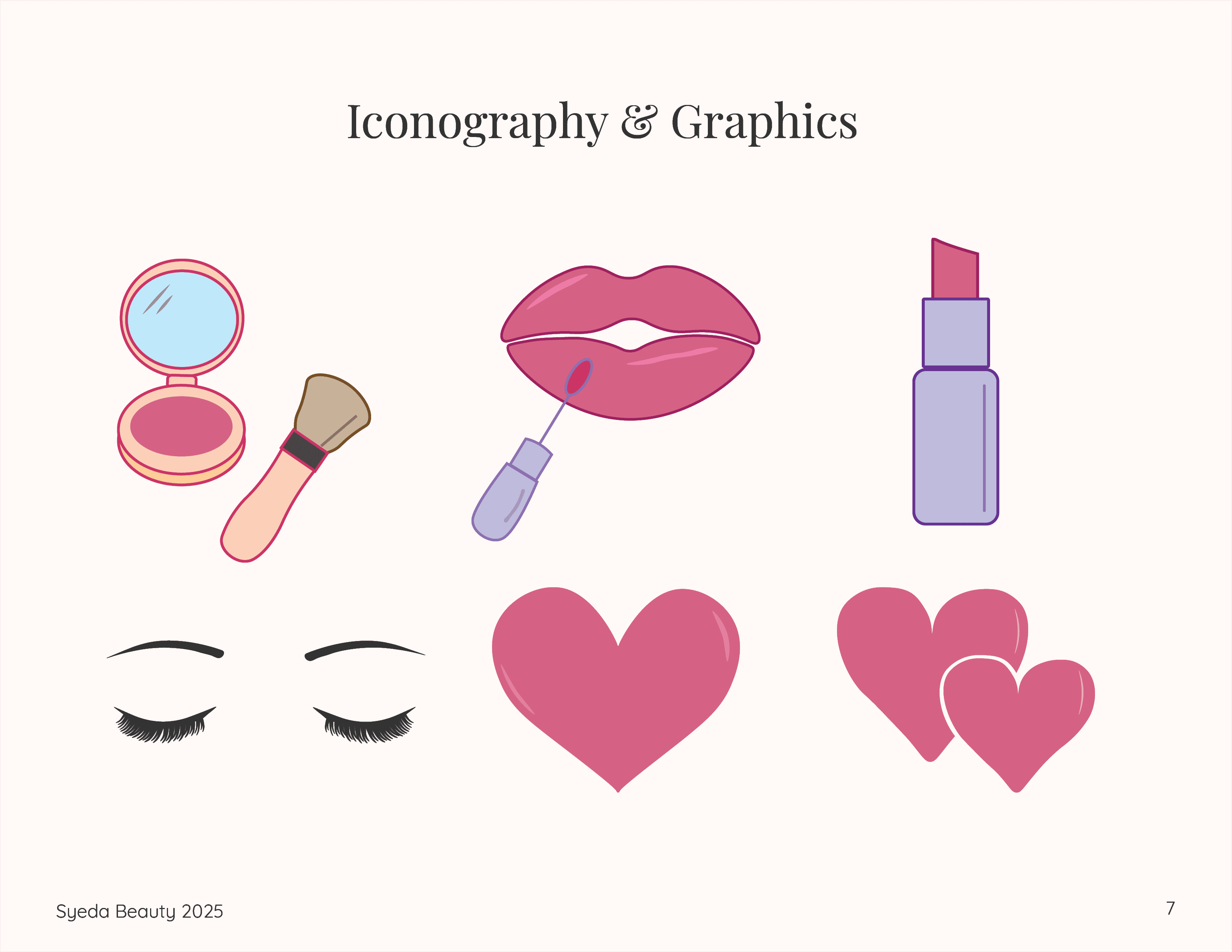
Thank You Card Design
The background featured the client’s chosen pink tone and incorporated a custom icon set I developed. These icons were based on both her current product line and her future plans (e.g. lip gloss and blush).
Thank You Card Design
The background featured the client’s chosen pink tone and incorporated a custom icon set I developed. These icons were based on both her current product line and her future plans (e.g. lip gloss and blush).
Client Feedback & Final Adjustments:
Appreciated the overall color palette and icons.
Requested:
A more refined serif or sleek sans-serif for typography.
“Thank You” to appear bolder and more high-end.
Simpler background design.
Larger logo with better placement.
Emphasis on the discount code.
More white space around “Hey There Gorgeous” for handwritten notes.
Color Palette Development
Based on client discussions, I finalized a palette including light pink, dark pink, black, nude, and gold. These tones offered flexibility across print and digital assets while capturing the brand’s elegant and feminine tone. The client approved the palette, especially liking how the gold and deep pink added richness to the overall aesthetic.

Phase 3 - Final Delivery
Phase 3 - Final Delivery
Final Logo
Rough Draft
#ddbe80
#eee2e4
#f7b0bd
#d46284
#333333
Hi-Fidelity Website Prototype
Although limited on time, I designed several high-fidelity screens to reflect the new visual identity. The prototype included the refined color palette, updated fonts, and branding direction. The client responded positively and had no further changes at the time of review.
Refining the Brand Color & Typography
After designing the initial web and print materials, I realized that the original pink chosen for the logo didn’t maintain consistency across the brand. I adjusted it to a lighter, secondary pink from the color palette for better harmony and readability across print and digital formats.
Business Model: Direct-to-consumer online retailer. Products are sourced from manufacturers and sold exclusively through the brand’s website.
Project Goals:
Rebrand with a more memorable, luxurious identity.
Expand the product line and shift the e-commerce platform from Wix to Shopify.
Boost brand visibility and grow social media following.
Redesign key brand assets to reflect a feminine, elegant, and bold aesthetic.
Phase 2 - Production
Typography Exploration & Logo Design
During the branding process, the client was very particular about the typography. From our initial meetings, she emphasized wanting "Syeda Beauty" to use two distinct fonts — “Syeda” in a script style, and “Beauty” in either a serif or modern sans-serif. After extensive trial and error and collaborative feedback, we landed on a combination that she felt aligned with her brand. I contributed to the final design by choosing the layout and color pairing, blending both typefaces in a way that felt cohesive and refined.
Business Card Design
For the front of the business card, I was inspired by eyelash packaging — placing a large lash icon prominently in the center, with the brand name just below it. The back of the card included key contact information and the logo.
Thank You Card Design
The background featured the client’s chosen pink tone and incorporated a custom icon set I developed. These icons were based on both her current product line and her future plans (e.g. lip gloss and blush).
Client Feedback & Final Adjustments:
Appreciated the overall color palette and icons.
Requested:
A more refined serif or sleek sans-serif for typography.
“Thank You” to appear bolder and more high-end.
Simpler background design.
Larger logo with better placement.
Emphasis on the discount code.
More white space around “Hey There Gorgeous” for handwritten notes.
Color Palette Development
Based on client discussions, I finalized a palette including light pink, dark pink, black, nude, and gold. These tones offered flexibility across print and digital assets while capturing the brand’s elegant and feminine tone. The client approved the palette, especially liking how the gold and deep pink added richness to the overall aesthetic.